Published December 19, 2023
UBNow: Rare books offer rare opportunity for UB art students
This article is republished from UBNow. Original here.
By VICKY SANTOS

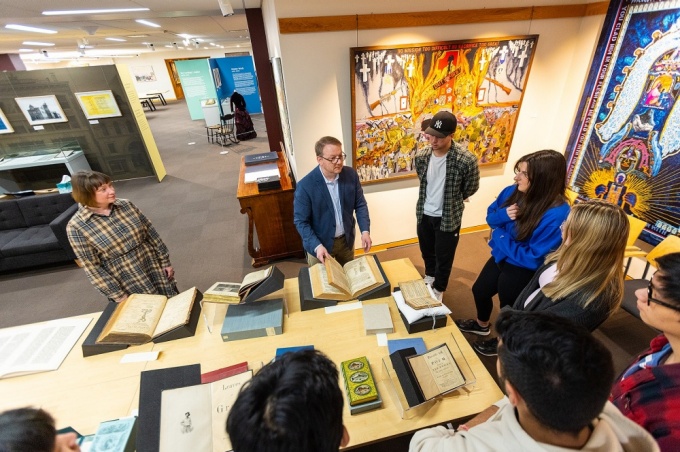
Art lecturer Kelly Myers-Chunco (far left) looks on while James Maynard (second from left), curator of the Poetry Collection and coordinator of the Rare & Special Books Collection, highlights one of the books he selected for students in Myers-Chunco’s typography class to examine. Photo: Douglas Levere
From deep within the UB Libraries’ Special Collections, a treasure trove of rare and unique books and poems has provided UB students the opportunity to learn about the history of Western typography from items dating back to the 1400s.
“I can show the students examples in a lecture, but it is a completely different experience to see the original works,” notes Kelly Myers-Chunco, a lecturer in the Department of Art. “The students can interact with these books; they can flip pages, explore the textures of the paper and printing methods.”
Students explored fine press editions, different styles of bindings, marginalia, fore-edge paintings, chapbooks, broadsides, artists’ books, typewriter art, visual poetry, installations, poem objects and other paper and printed items.
Students were afforded this guided tour of works from Special Collections thanks to a collaboration that began about four years ago between Myers-Chunco and James Maynard, curator of the Poetry Collection and coordinator of the Rare & Special Books Collection.
“Jim is very kind to pull these extremely rare examples from the collection for my typography class. The students receive an overview of the collection, beginning with Thomas Lockwood, and they might not be familiar with the incredible resources they have at hand,” Myers-Chunco says.
In Art 322 Typographic Systems, Myers-Chunco has her students focus on the use of typography in graphic design.
“In speaking with Jim, I realized we had an amazing resource at UB that would be beneficial for my graphic design students,” Myers-Chunco says.
To demonstrate some of the possibilities for their class projects, Maynard also set out a large variety of items that emphasize the visual expression of poetry.
“In selecting these particular works and formats, I wanted to demonstrate how every published poem is an embodied experience, and that different presentations of the same poem create different reading experiences,” Maynard explains. “Beginning with the history of the book and knowing that Kelly’s poetry assignment would require her students to think about the interpretive consequences of design, I wanted to start a conversation about the relationship between content and form, and to consider how every material aspect of printing can be expressive.”

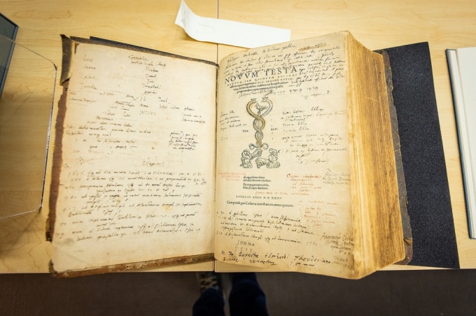
“Erasmus’ New Testament” is one of the rare books examined by students in Kelly Myers-Chunco’s class. The hand-written notes in the margins are from previous owners and are always a source of fascination for all ages, according to Myers-Chunco. Photo: Douglas Levere
Students were able to walk around Special Collections in 420 Capen Hall and examine the pieces.
“Erasmus’ New Testament is always a highlight,” Myers-Chunco says. “Seeing the marginalia — hand-written notes in the margins by previous owners — is fascinating. It all adds up to a delightful sensory experience that forms a deep reverence for the written word in print. Typography becomes art and a highly technical craft.”
The class culminated with a visual poetry project, where the students were required to visually interpret a poem using type and minimal graphics to convey the meaning or “voice” of the poem.
“The format is open — we’ve had poems embroidered on suit jackets, origami birds, giant paper fortune cookies, screen-printing and letterpress,” Myers-Chunco says.
Final class projects for Art 322 can be viewed online.


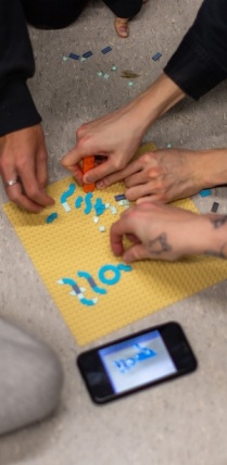
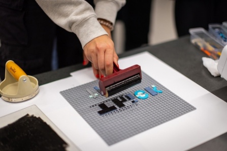
Lego pieces serve as a letter press for students in Kelly Myers-Chunco’s Art 321 class. The class was divided into groups and each group used the Lego pieces to develop a new typeface for their final projects. Photos: Douglas Levere
Legos as inspiration
In another class Myers-Chunco teaches — Art 321 — students develop a new typeface for their final project.
“We take inspiration from patterns and shapes in the environment around us and turn it into a working font,” she says.
The class is divided into groups and each group chooses an adjective and decides how to visualize that word in a modular format — set pieces in a grid. Myers-Chunco then asks each group about their word — is it happy, serious, energetic, graceful, etc. — and then has them relay this information to a viewer beyond the word with set forms and shapes.
To show the class what was possible, Myers-Chunco brought in small, flat Lego pieces for students to work with as part of their typeface experiments.
“Bringing in the Lego pieces showed us that we were not limited to making just a blocky, 8-bit font; we could make curves and swirls,” says student Jade Valkwitch. “Then we had to flip the entire word to print it; rolling the ink on the flat Legos and pulling the paper off to reveal the word was like being a mini printer.”
Valkwitch says the experiment was fun and creative.
“This way of brainstorming and looking at a typeface a different way definitely helped me develop ideas for my own project,” Valkwitch says.
According to Myers-Chunco, the Lego type exercise focuses on the basic elements that comprise a letterform, and the students then print their words from the Lego plates.
“The students gain an appreciation for the traditional method of letterpress printing — setting type backward, inking the plate, applying the correct pressure to form a print,” she says. “It’s a slow, thoughtful, methodical approach — no Command Z here!”