Identity and Brand
The Marketing and Communications team are ambassadors for the UB Identity and Brand. We assist our community in developing communications and marketing collateral that aligns with the brand while reflecting the unique characteristics of the individual department or program.
Identity and Branding include:
Maintaining consistency in the branding and language used for all entities across the university is important.
Units and entities across the University at Buffalo—including schools, colleges, departments, divisions, and offices—must be linked to one of the following formal academic names.
- University at Buffalo
- University at Buffalo, The State University of New York
- [College of Arts and Sciences or Department Name], University at Buffalo
- [College of Arts and Sciences or Department Name] at the University at Buffalo
- University at Buffalo [College of Arts and Sciences or Department Name]
- UB [College of Arts and Sciences or Department Name]
There are no other approved names for the university. Using “SUNY-Buffalo” and different versions of the official names is not permitted.
For example, The College of Arts and Sciences, University at Buffalo, the Department of Indigenous Studies at the University at Buffalo, the University at Buffalo Philosophy, Politics and Economics Program and the UB Department of Physics. See other naming best practices below.
You can choose whether to include The State University of New York (SUNY) system name. The system name is available for use by all entities.
One unit serves as the administrative school for dual and combined degrees, but both schools should always be treated equally in body copy and logo placement.
One should not be bigger than the other or receive more prominent placement. When listing both schools in copy, there’s no rule for sequence; it should just be consistent.
Examples:
- The UB Teach program is a collaboration between the College of Arts and Sciences and the Graduate School of Education, offering students the opportunity to earn their bachelor’s and master’s degrees in just five years.
- The BA/MSW combined degree program, offered jointly through the College of Arts and Sciences and the School of Social Work, leads to a bachelor's degree in social sciences interdisciplinary with a concentration in health and human services and a Master of Social Work (MSW) degree.
Official designation:
The University at Buffalo is a flagship of the State University of New York.
Approved condensed variations:
- The University at Buffalo, New York State’s flagship
- The University at Buffalo, a New York State flagship
- The University at Buffalo, a flagship of New York State
- UB, a flagship university of New York State


NOTE: “New York’s flagship university” or “New York State’s flagship university” is also acceptable as a standalone phrase as long as there is other content that makes it clear we’re referring to UB (e.g., on an official UB website or in UB’s social media bios)
Here are best practices when writing or communicating to an external audience, such as websites, emails, social media, etc.
- The ampersand (&) should not be used in place of “and.”
E.g., College of Arts and Sciences. Not College of Arts & Sciences. - Write out the department's full name. E.g., The Department of Theatre and Dance. Not Theatre and Dance, Dance, or THD.
- Use first-year to describe students in their first academic year, i.e., in their first or second semester of college.
UB Brand fonts may only sometimes be available in Word documents, PowerPoint presentations and other digital applications. To ensure brand consistency, please use the appropriate font substitutes of Arial and Georgia.
If you want access to the UB Brand fonts, please check out your Department Branding Toolkit or fill out a marketing and communication request to get the font files sent to you directly.
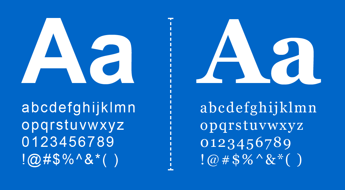
Sample of the substitute fonts, Arial and Georgia.
NOTE: These fonts are not used to create the lockups, and only University Communications is authorized to create institutional marks. Please visit the Department Branding Toolkit to obtain your official lockup.


Our palette represents our community's vibrant and tenacious nature, as well as our rigorous academic standards and storied history.
The College Color Palette


UB Blue
CMYK: 100/53/0/0
PMS: 2935
RGB: 0/91/187
HEX: #005bbb


Hayes Hall White
CMYK: 0/0/0/0
PMS: White
RGB: 255/255/255
HEX: #ffffff


Harriman Blue
CMYK: 100/30/19/76
PMS: 3035
RGB: 0/47/86
HEX: #002f56
Sector Color Palette
The College is the largest unit on campus, with all departments and programs broken up into three sectors. For a consistent brand experience, each sector has a unique pop of color to be used in conjunction with UB Blue, Hayes Hall White and Harriman Blue.


Lake LaSalle
CMYK: 66/0/39/0
PMS: 3265
RGB: 0/166/156
HEX: #00a69c


Solar Strand
CMYK: 0/19/89/0
PMS: 123
RGB: 255/199/44
HEX: #ffc72c


Victor E. Blue
CMYK: 67/2/0/0
PMS: 298
RGB: 47/159/208
HEX: #2f9fd0


Letchworth Autumn
CMYK: 0/72/70/0
PMS: 7416
RGB: 229/106/84
HEX: #e56a54
Designing for accessibility
We want our communications to resonate with all audiences, so take consideration when choosing color combinations for digital and print communications. Our color palette has been optimized for compliance with the Americans with Disabilities Act (ADA)—an equal opportunity law for people with disabilities—so it’s visually effective and functionally useful.
Here are some tips to help make your communications accessible to all.
Don’t rely on color alone
Since some users may override page colors, color should not be the only way information is conveyed. Make sure information is available even if colors are altered. This means adding another cue, like an underline, to show a link or an icon to reinforce the meaning.
Provide high contrast
Pay special attention when using light grays, oranges and yellows. Check your contrast levels with the WAVE color contrast tool.
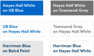
Best practices for using text and color
Use the following text colors:
- Hayes Hall White on UB Blue
- Hayes Hall White on Townsend Gray
- UB Blue on Hayes Hall White
- Townsend Gray on Hayes Hall White
- Harriman Blue on Baird Point Gray
- Harriman Blue on Hayes Hall White

Accessibility Training Available
A free online educational resource is available to improve your web accessibility knowledge and skill set through Deque University. The full curriculum contains over 30 courses on creating accessible documents, testing and more, which are extremely valuable to web developers, content editors and all faculty and staff who create online materials.
College departments, programs, centers and institutes are "sub-brands" of the main College of Arts and Sciences lockup, a "brand extension" of the main University at Buffalo lockup. Sub-brand lockups should be used as the "logo" on all print and digital materials.
Download your department lockup


College of Arts and Sciences
Unit Lockup, UB Brand Extension


Department of Geography
Unit Lockup, UB Sub-Brand
Understanding department lockup design files and when to use them
Each department lockup can be found in the Department Branding Toolkit. In the toolkit, you'll find the following color and file formats. Learn when it's appropriate to use each file.
Color Formats
CMYK (Cyan, Magenta, Yellow, Black) design files are for any project that will be physically printed, not viewed on a screen.
Best for posters, business cards, brochures, postcards and other commercial printing.
RGB (Red, Green, and Blue) design files are for displaying your lockup on a digital screen.
Best for digital images on websites, emails, TV displays, presentations, virtual backgrounds and mobile applications.
Spot design files are used when working with outside vendors to print merchandise.
Best for shirts, pens, or any other promotional items.
File Formats
JPG is also a raster-based image file format, compatible with most Microsoft Office programs and Adobe Creative Suite applications. Like PNG files, JPG files cannot be enlarged beyond their size without distortion. Unlike PNG files, they do not support transparency and will have an opaque box around the image in Microsoft Office programs.
Best for web or print applications where transparency is not required.
PNG is a digital image file format. It is raster-based, meaning it’s composed of a set number of pixels with a specific resolution. Therefore, enlarging a PNG file beyond its original size will cause significant blurriness or distortion. PNG files have transparent backgrounds and are compatible with most Microsoft Office products.
Best for digital applications such as websites and emails.
EPS is a file format for vector-based graphics such as icons, logos and types. Vector graphics are made up of paths rather than pixels, so they are resolution-independent; i.e., they can be scaled to any size without distortion. While EPS files comply with most graphic design programs, including Adobe Creative Suite applications, they do not function in Microsoft Office programs.
Best for merchandise, logos and illustrations that require a range of sizes and scales.
Purchasing Merchandise
Before ordering promotional items or merchandise, you'll need to work with approved vendors and complete the UB trademarks request form to get approval from UB Trademarks and Licensing to purchase items with your department lockup.
Brand consistency is the key to successful branding and the root of the University at Buffalo—including schools, colleges, departments, divisions and offices—identity.
The College of Arts and Sciences Office of Marketing and Communications and University Communications has created a toolkit with department-specific templates that adhere to brand and accessibility standards, an approved stationery system and photo guidance to help select visual assets that capture the spirit of UB and the College.
Department Branding Toolkit
The Department Branding Toolkit gives you access to department-specific templates that include best practices and step-by-step instructions on how to use the template to ensure consistency across the College.
Stationery System
University stationery is a tangible expression of our brand identity. These standardized designs ensure consistency and impact in our written communications.
Print Services is the exclusive provider of all printed UB stationery.
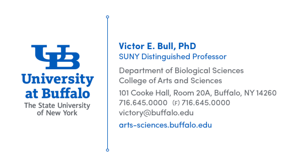
Business card Guidance
Business card template includes:
- Individual’s name
- Title
- Department name
- School
- University mailing address
- Telephone and fax numbers (optional)
- UB email address
- Your department's main website
Letterhead Guidance
Letterhead is available in master brand, brand extension and sub-brand templates.
Letterhead may include:
- Department name
- School
- University mailing address
- Telephone and fax numbers
- UB email address
- Your department's main website
Special Ordering Instructions
When ordering, specify which sub-brand logo you'd like in the Special Instructions after proofreading and submitting the order. Print Services will send you a proof with the correct lockup before printing.
Envelope Guidance
Envelopes are available in master brand, brand extension and sub-brand versions.
Envelopes may include:
- University master brand mark, brand extension or sub-brand lockup*
- Department name
- University mailing address, including building name and room number
*For mail to be correctly delivered, the university name must appear as part of the return address. This requirement is accomplished by using an approved logo or lockup.
Special Ordering Instructions
When ordering, specify which sub-brand logo you'd like in the Special Instructions after proofreading and submitting the order. Print Services will send you a proof with the correct lockup before printing.
These Microsoft Word letterhead templates make it easy to create customized digital stationery to use in email, web and other electronic applications
The templates below are for electronic communication only.
All printed UB stationery must use the official brand typefaces and watermarked paper stock available exclusively through Print Services.
Download:

Sample of the standard digital stationery.
Department Branding Toolkit
Access department-specific branded templates, lockups, virtual backgrounds and more in the Department Branding Toolkit. If you need additional resources, submit a marketing and communications request.
Images and videos are powerful assets that help us tell the rich, full story that is distinctly UB. To ensure your message is clear, compelling, and on-brand, our team can assist in various ways:
- Arranging Professional Photography: We'll help coordinate with experienced photographers or university photographers to capture high-quality images for events, classroom activities or special projects.
- Guidance for Professional Headshots: Get tips and support for capturing professional headshots, either from the UB Portrait Studio or by taking your own portrait.
- Finding the Right Image: We can help you select the perfect image that fits your needs and aligns with UB's brand.
- Strategizing Video Content: We’ll help you develop and strategize video content to meet your communication needs effectively.
Before you begin: Please review the resources below to ensure your visual content effectively communicates your message and represents UB's identity. For assistance, submit a marketing and communication request 4-6 weeks in advance as we cannot guarantee the photographer's availability.


We offer a variety of Microsoft Word templates, email signatures, virtual backgrounds and more for departmental use and quick turnaround projects. These templates come with best practices and step-by-step instructions to ensure consistent branding across the College.

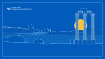
Example of a virtual background.
Department Branding Toolkit
Access department-specific branded templates, lockups, virtual backgrounds and more in the Department Branding Toolkit. If you need additional resources, submit a marketing and communications request.
Visit the university communications' website to explore the strategy behind the brand. Learn about the proper use of the university's identity, creativity, resources and more.
Marketing and Communications Request
Following these guidelines and using the provided resources ensures your materials consistently represent UB's brand and values. If you need further assistance, please reach out to our team by submitting a marketing and communications request.
Marketing and Communications Consultations:
We offer consultations to collaborate on the best strategy to meet your department’s needs. Our consultations also include content and design reviews to provide feedback on items, ensuring they meet UB's brand and accessibility guidelines.
Schedule a consultation by submitting a marketing and communications request.